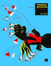
True Fairy Tale is unusual courage of the graphic design and entire visual concept. It’s a coherent, intriguing story. One just can’t wait for opening a succeeding page: not only because of suspense but above all because of the exciting graphic design. The latter just puzzles the reader with its formal simplicity (with dominance of just basic geometric shapes and lines winding through the most of the story of spider web) and sparing usage of colours (except white and black only triad of primary colours are being used) obviously inspired by neoplasticism. Reader is seduced by simplified presentation concepts – for instance: yellow ring – sunny days and blue square: Côte d'Azur, empty spread – iceberg. At the same time the story of holiday trip by black Volvo (black square) and adventure with spider (ring) is set on the pages of textbook on 20th century art history (compositions of Mondrian, squares of Malewicz, minimal art, op-art, constructivism, Italian futurism, soviet posters these are just selected tracks). Every component of the book is consequently designed: typography, title page, endpapers and the other). True Fairy Tale is a real masterpiece of the top of book’s graphic design quality. The one we have not had so far!
